- Media
- Brand Guidelines
Logo
The logo is our most important brand carrier - regardless of company and business area. It represents community and strength. The three lines remind us of our values: Responsible - Enthusiastic - Honest. This is our DNA and forms the backbone of the logo.
Below are various logo variants and file formats. Common corporate logos are used across all subgroups, to support our common identity, culture and brand. Exceptionally, a logo with a url is used, which is sorted by company.
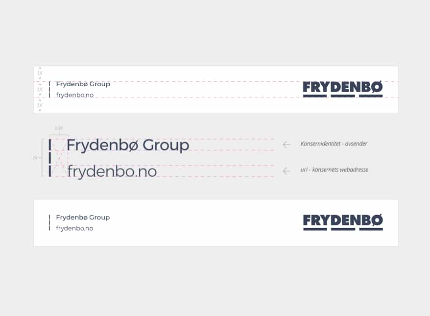
Profile-bearing unit with company identity and logo
Rule: The profile bearing unit always consists of four elements; the value band (the three lines), corporate identity (company name), url (without www) and our common logo. The unit is our most important imprint and is an informative messenger that differentiates our various companies, while at the same time clearly showing that we are one unified group.
Exception: Exceptions for use are small media surfaces or odd formats


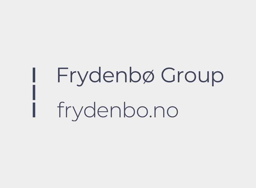
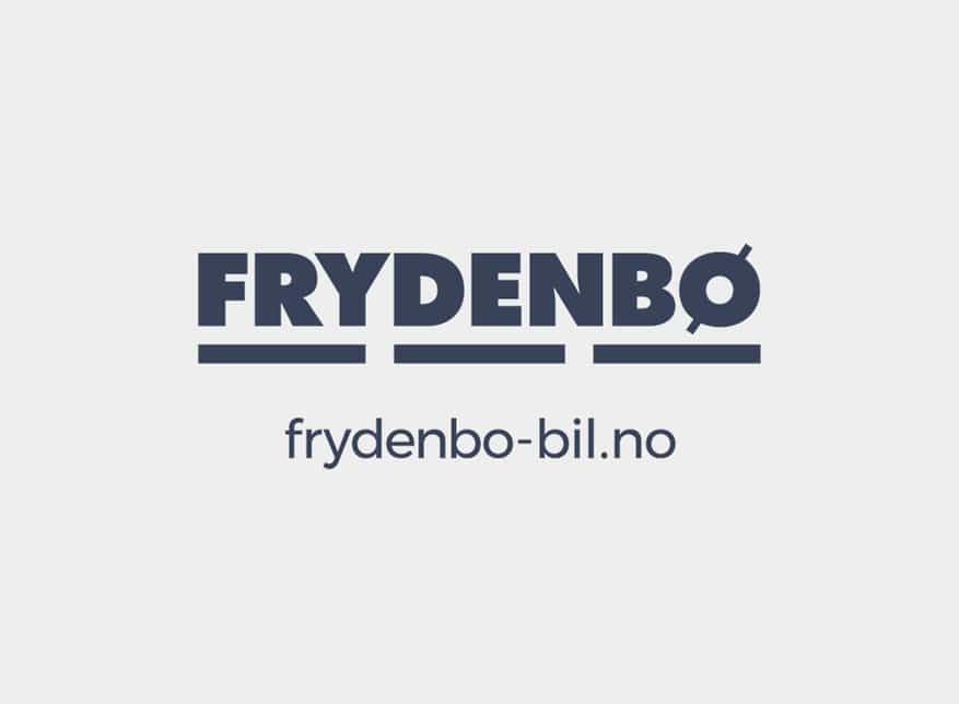
Logo with URL
Below are variants of the logo with urls. Common corporate logos are used across all subgroups, to support our common identity, culture and brand. Exceptionally, a logo with an url is used, which is sorted by company. In some formats, where it is not possible to use a profile-bearing device - a logo with an url can be used. The url must always appear without www, be in lower case, and be centered under the logo.
Display font
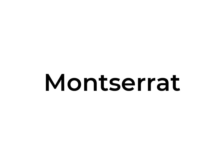
Montserrat is a san serif font designed by a design group led by Julieta Ulanovsky. The font is chosen as a display font due to its simple and clear shape and appearance.
Montserrat is available in 18 weights, which makes the font very useful and expressive. Primary weight for use in headings is Montserrat Medium. The secondary weight for use in subheadings is Montserrat Regular.
Montserrat is licensed under Open Source and can therefore be used free of charge. The font can be downloaded from Google Fonts ™
Text font
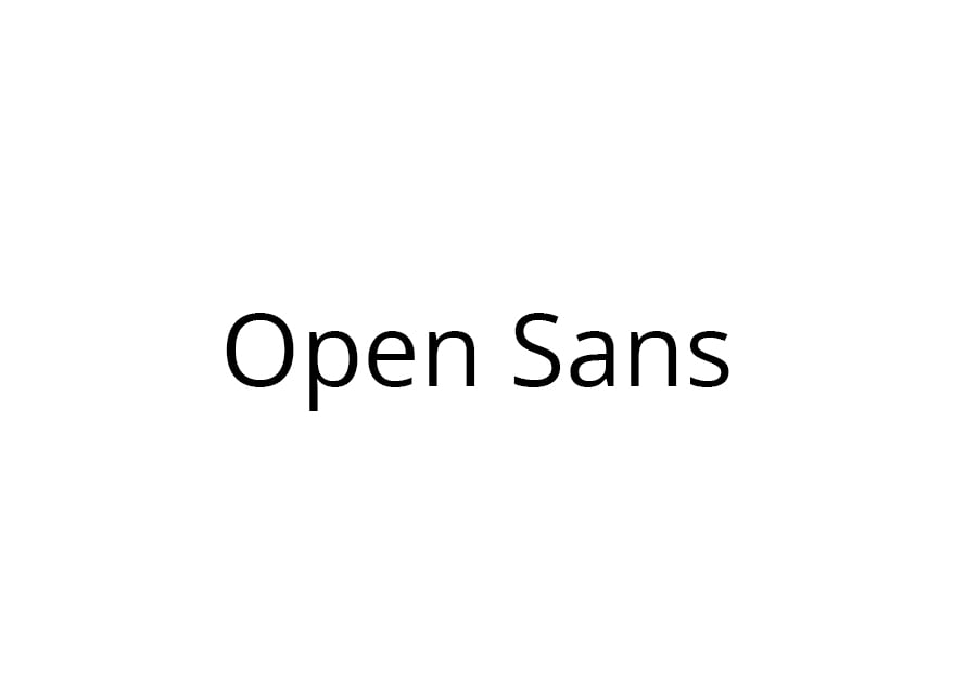
Open Sans is a humanist sans serif font developed and designed by Steve Matteson. We use Open Sans as our primary font for large amounts of text. Popularly called body text.
Primary weight for use in setting body text is Open Sans Light. A simple and very readable font that fits well with large amounts of text. Secondary weight for use in subheadings is Open Sans Regular. A weight class that solves the task elegantly without becoming too dominant.
Open Sans is licensed under Open Source and can therefore be used free of charge. The font can be downloaded from Google Fonts ™


